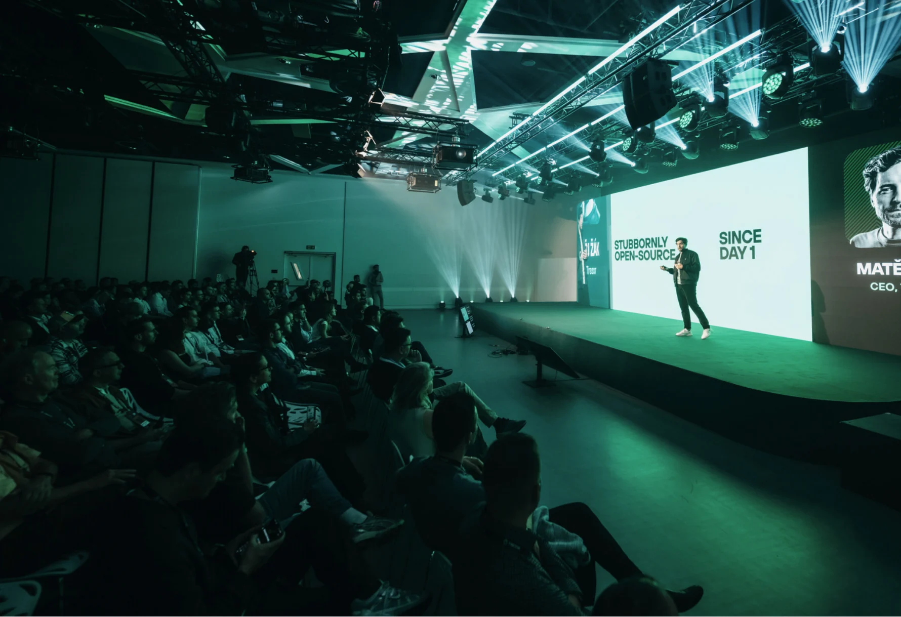
Making Trezor crypto security feel human
Context
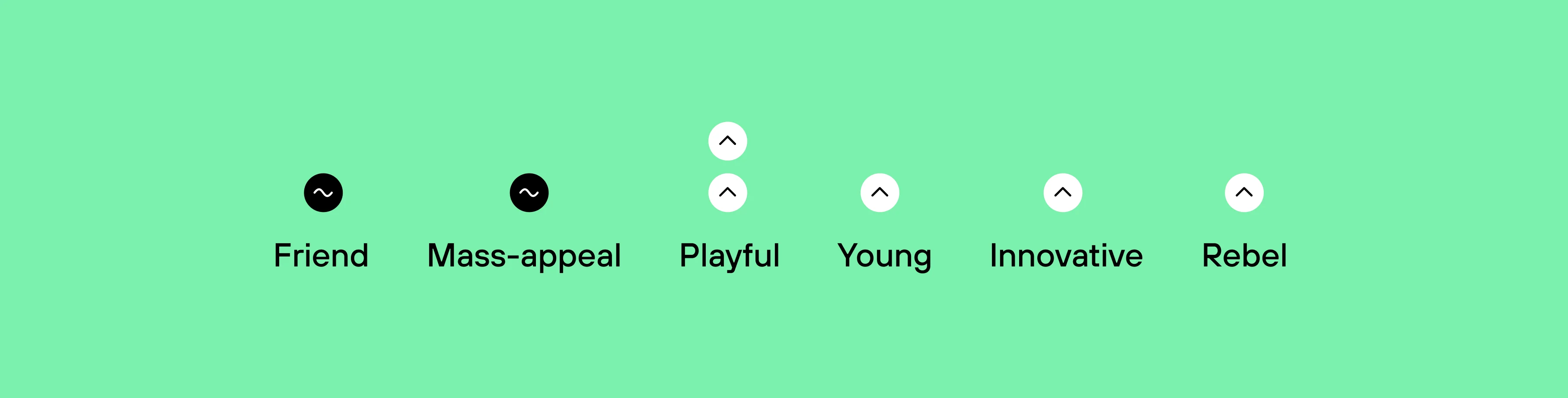
Crypto security had a voice problem. Too much technical jargon, threat scenarios, and shady aesthetics. It works well for people already in crypto – but it can quietly tell everyone else that this isn't for them.
The business saw an opportunity. Most crypto owners still don't use a hardware wallet, and the barrier isn't really technological. It's emotional. The strategy, set by the company, was to open Trezor up to a much wider audience: more approachable, lifestyle and human.
The tricky part was that warmth and trust don't naturally go together. Make a security brand too playful and it can stop feeling safe. That was the line the facelift had to walk.
My Role
My job was to turn that direction into something tangible – to figure out what "human" actually meant visually, and how it could work consistently across the brand.
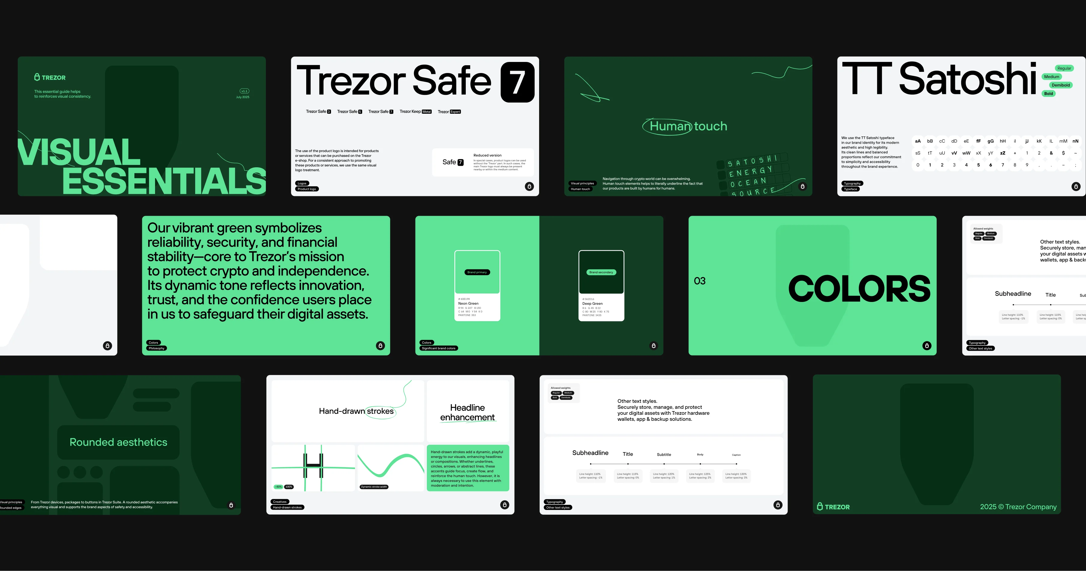
I owned the visual translation: the design of the identity refresh, art direction, the guidelines, and the creative variants we later put to the test. The testing methodology itself was designed by our Head of Design – I defined what we should test.
The Translation
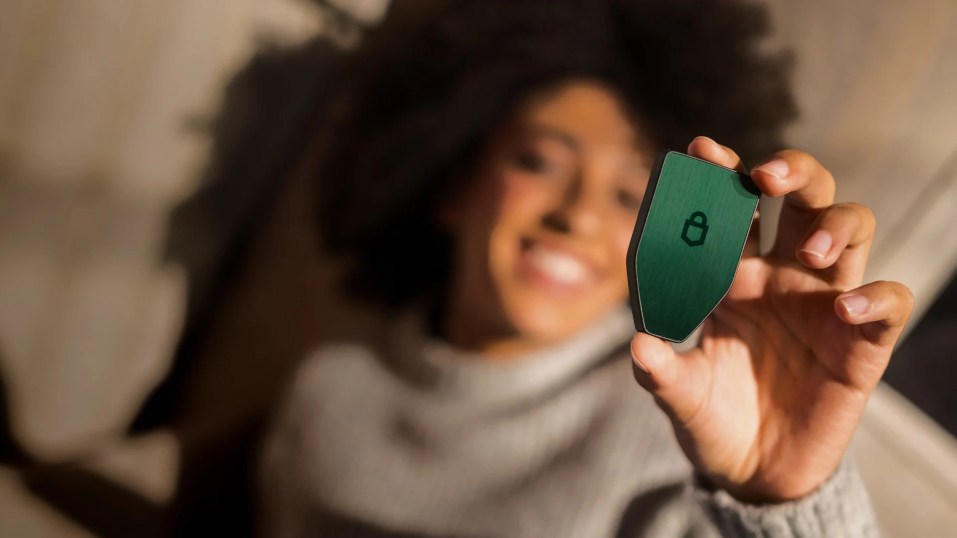
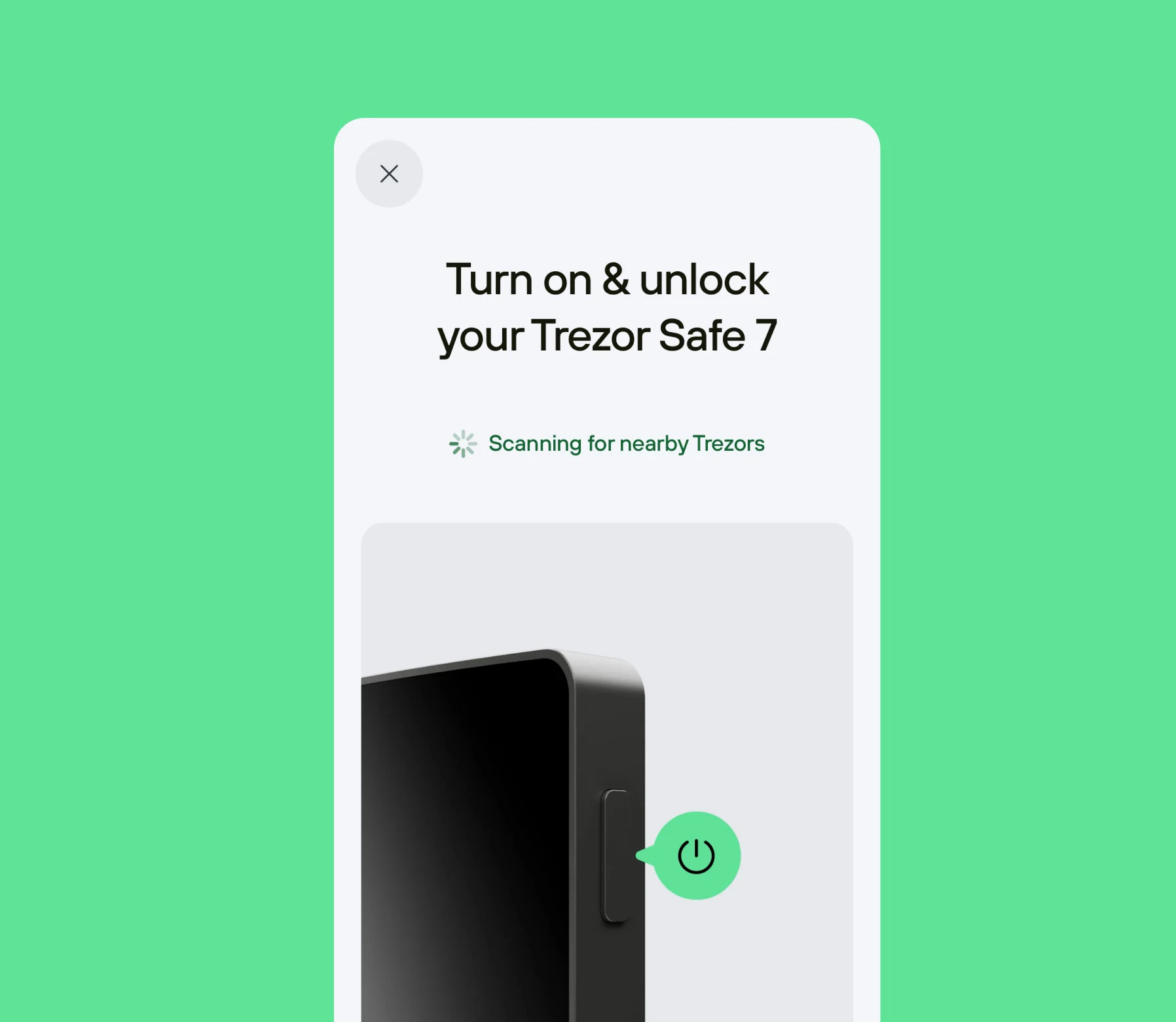
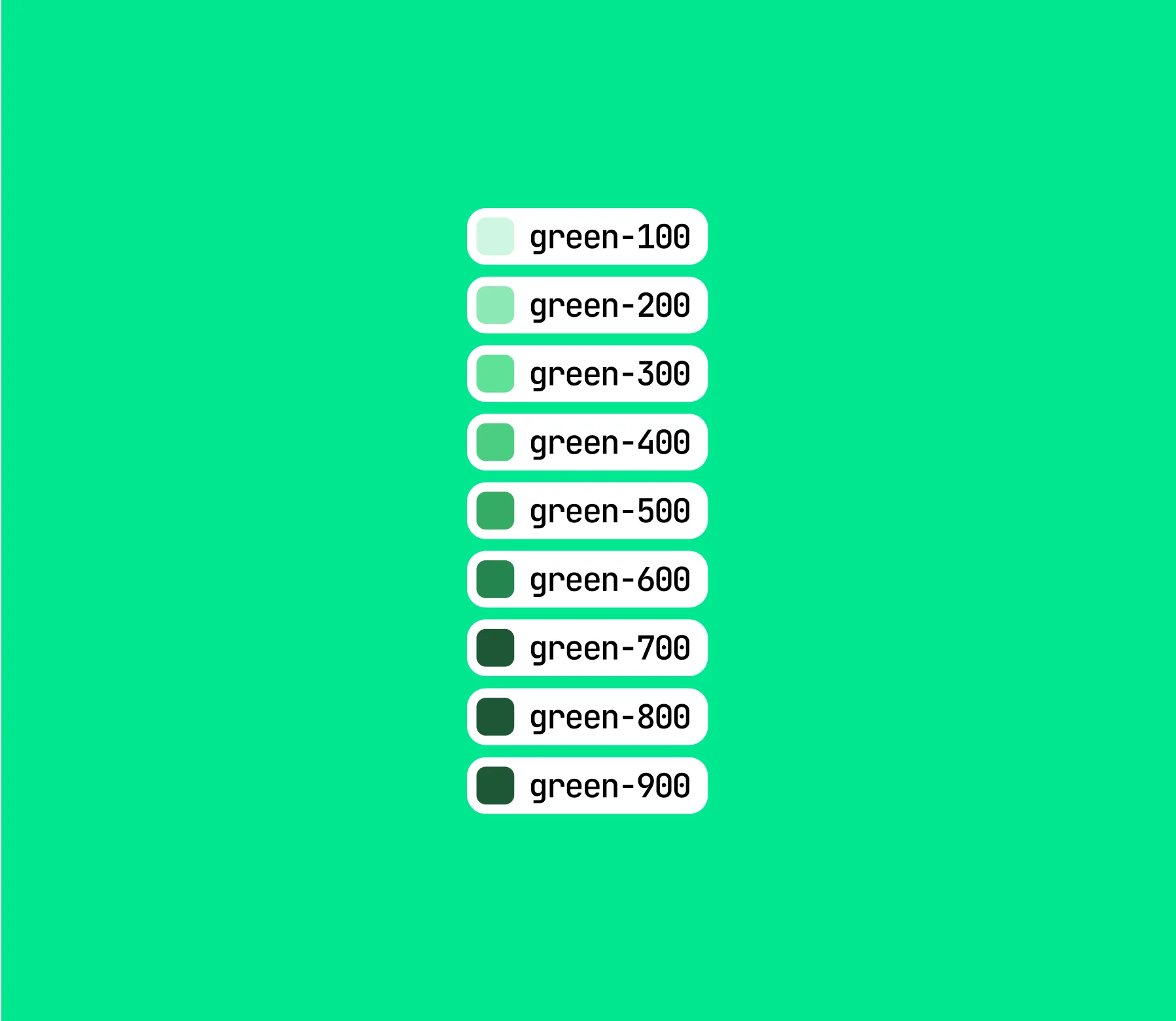
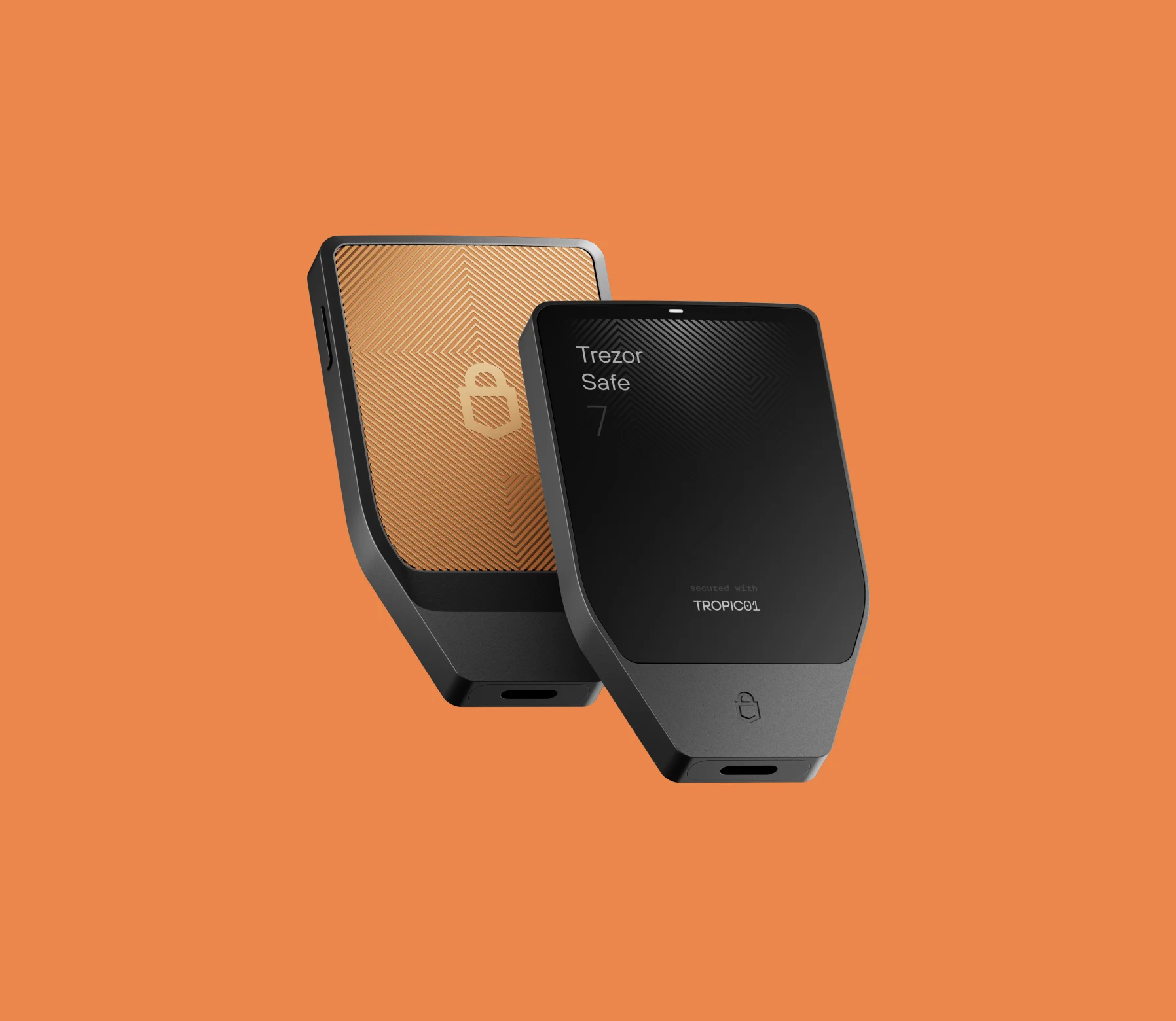
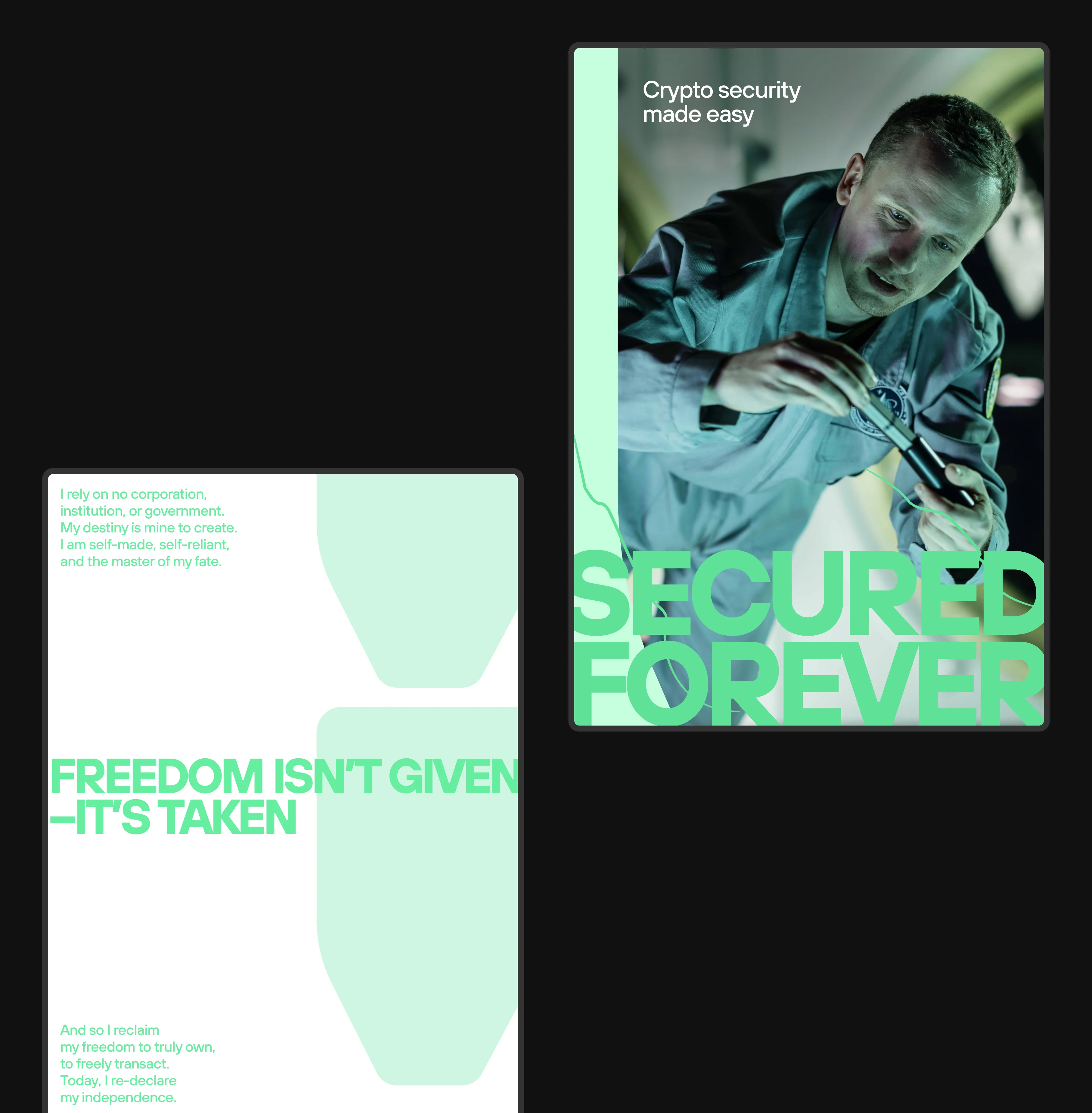
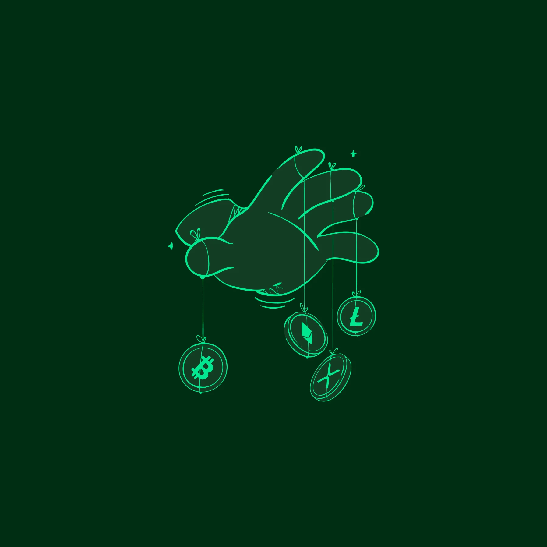
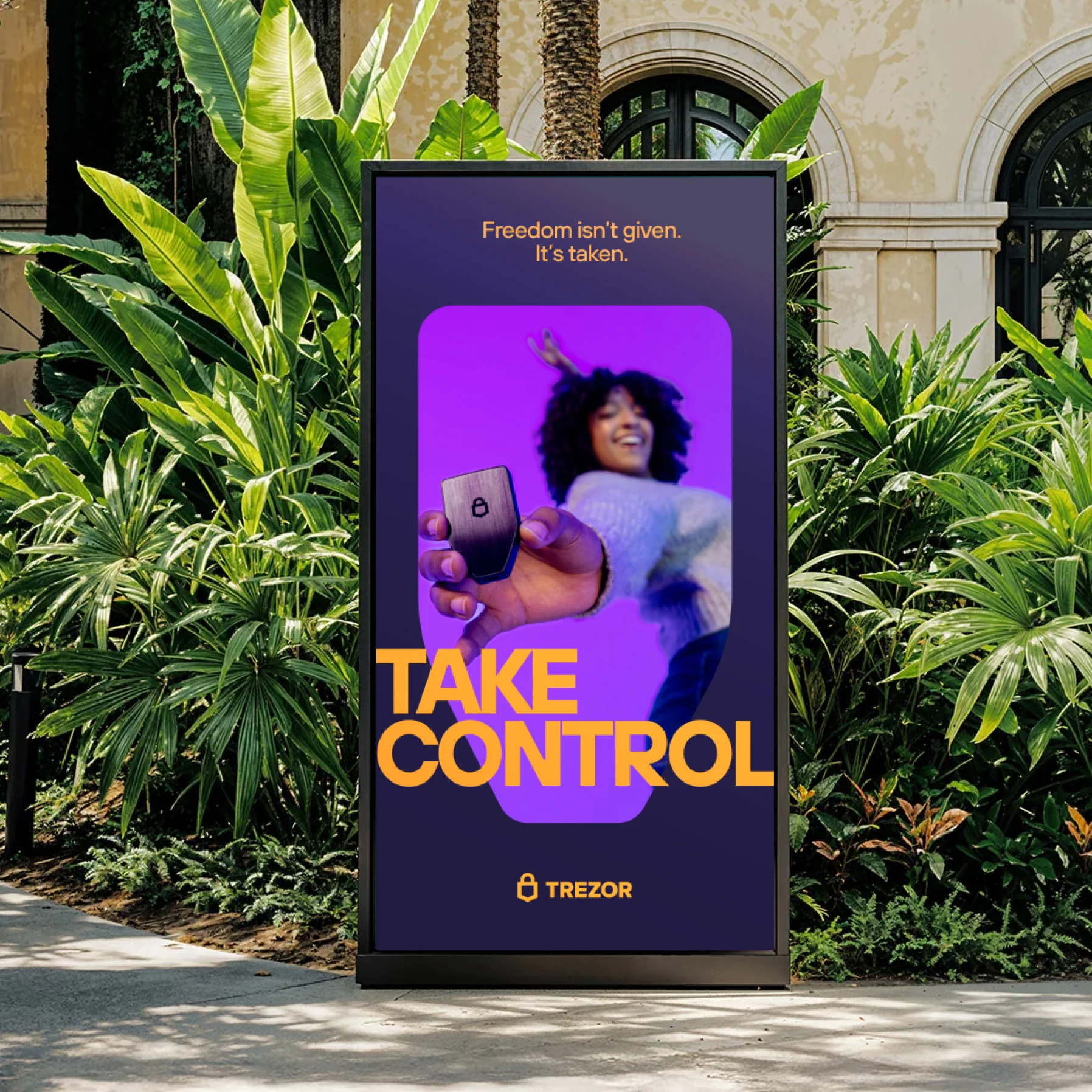
How do you make security feel warm without making it feel soft? Not by decoration. By changing what the brand shows and how it speaks. Illustrations became the carrier – distinctive enough to work as a brand device, functional enough to explain complex ideas simply. Color moved from dark and defensive to open and confident. Photography traded server-room aesthetics for real life – because that's where self-custody actually happens. The result was a refreshed identity that could only be Trezor, but stopped being a brand only insiders could love.




Proving it works
A brand trusted with billions doesn't get to redesign purely on instinct. So we treated the facelift as a hypothesis rather than a conclusion.
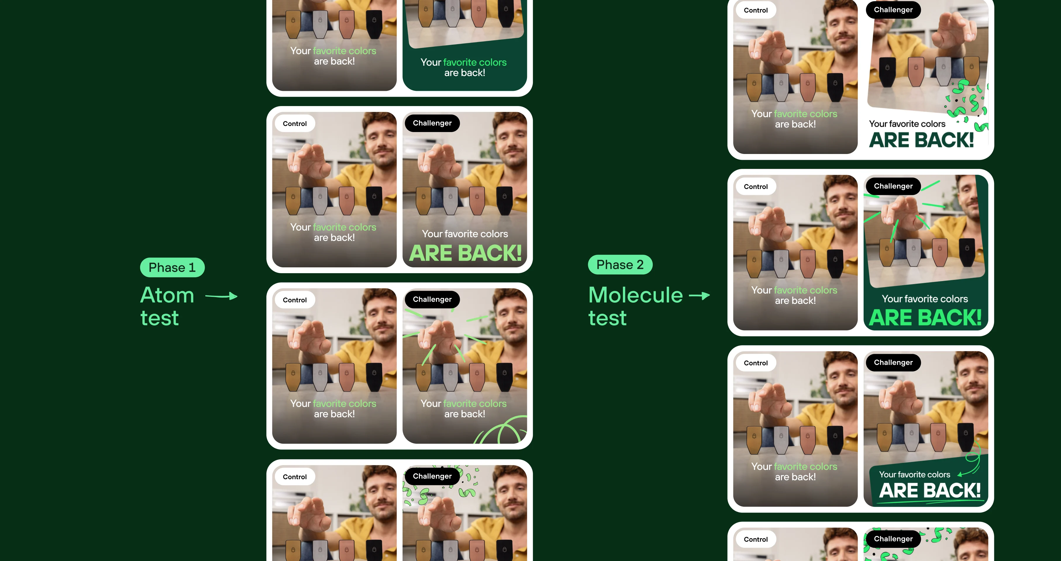
We started qualitatively, looking at how people perceived the old identity compared to the new one across our brand value scales. Then we went quantitative. We broke the new identity down into its individual elements and tested them against each other, as well as against the previous identity, through structured A/B rounds on Meta.
The strongest elements were then recombined and tested again. The facelift outperformed the original identity by double-digit percentages in ad performance. At that point, the direction wasn't just something we liked – we had evidence that it was working.
Rollout
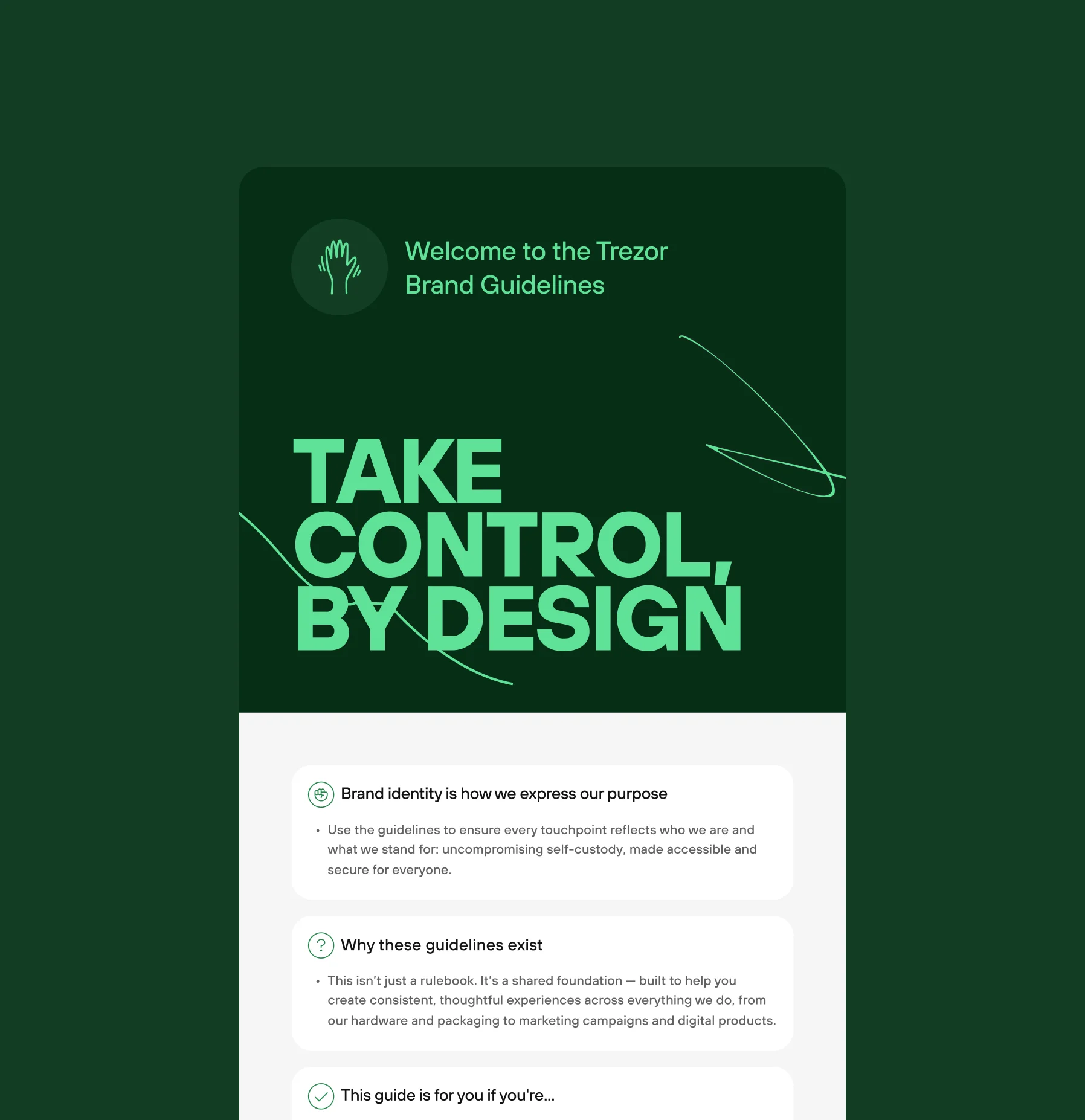
An identity only works if people can actually use it. So the rollout wasn't just about handing over a set of guidelines. A big part of it was getting the company and the wider team to understand the thinking behind the new direction.
We ran sessions across the company and design team, presenting not only what had changed, but why. The goal was to make the identity part of people's everyday working language rather than something owned by the design team.
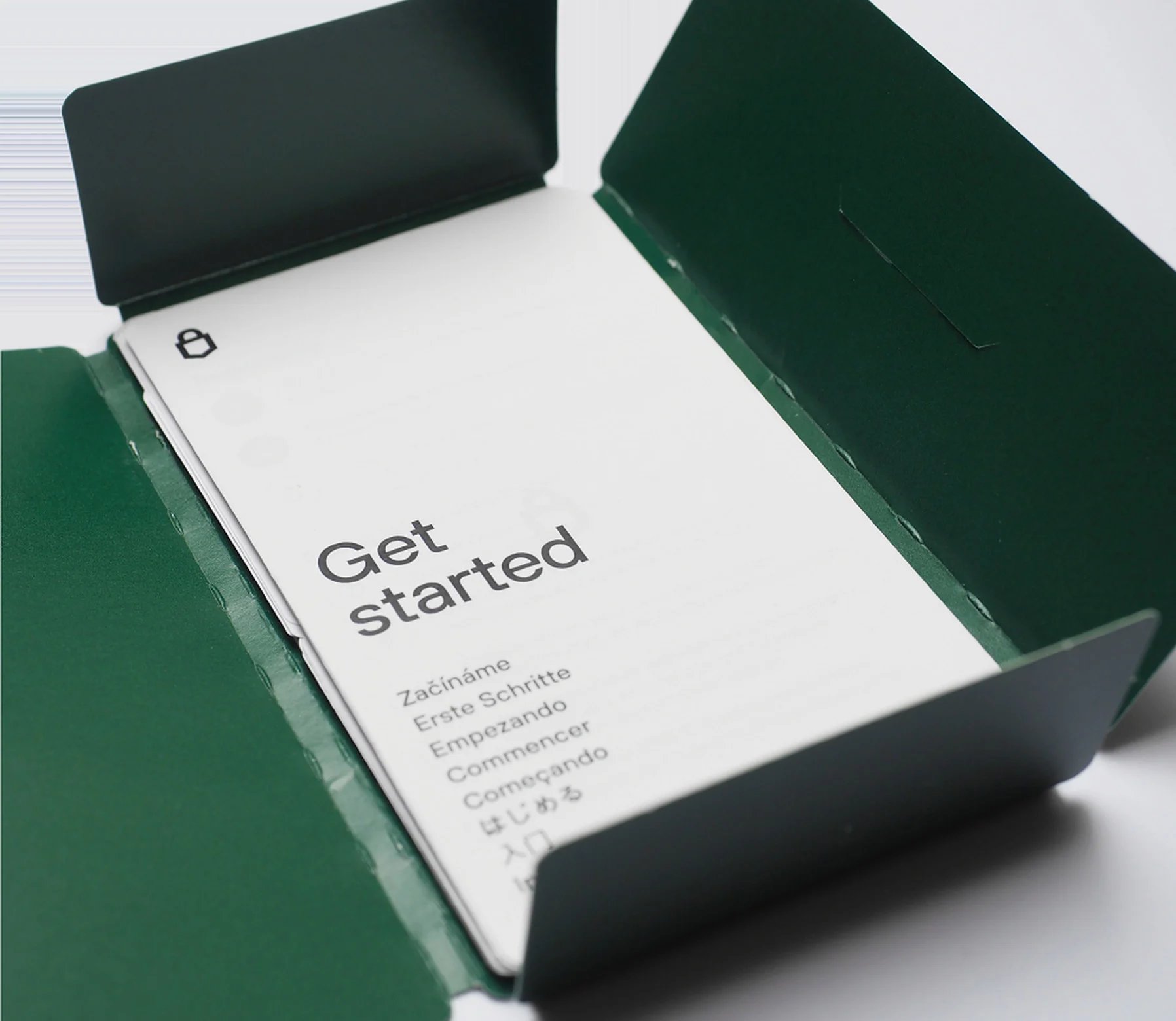
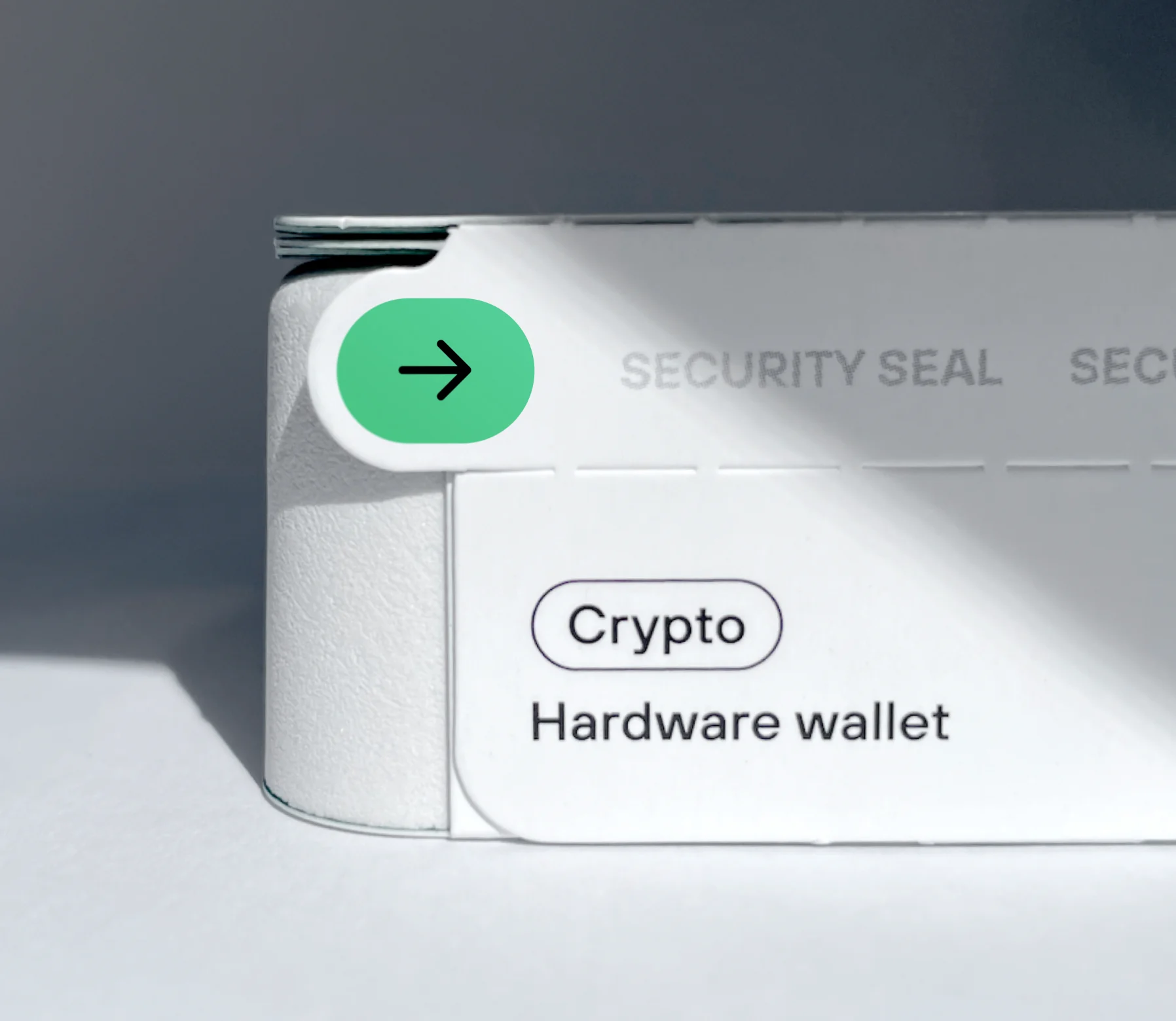
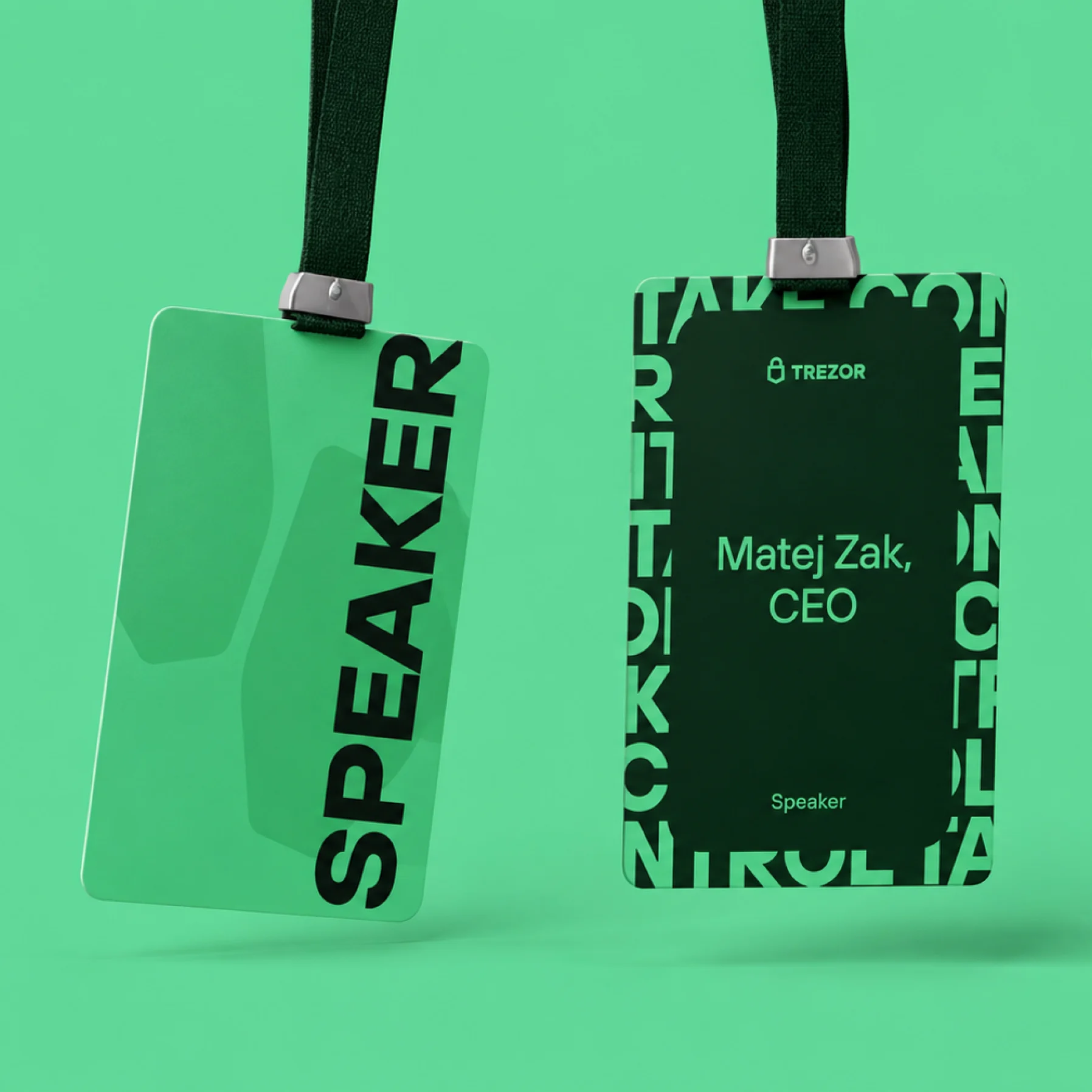
What followed was the identity in use – from packaging and the e-shop vision to campaigns and communications across different touchpoints.
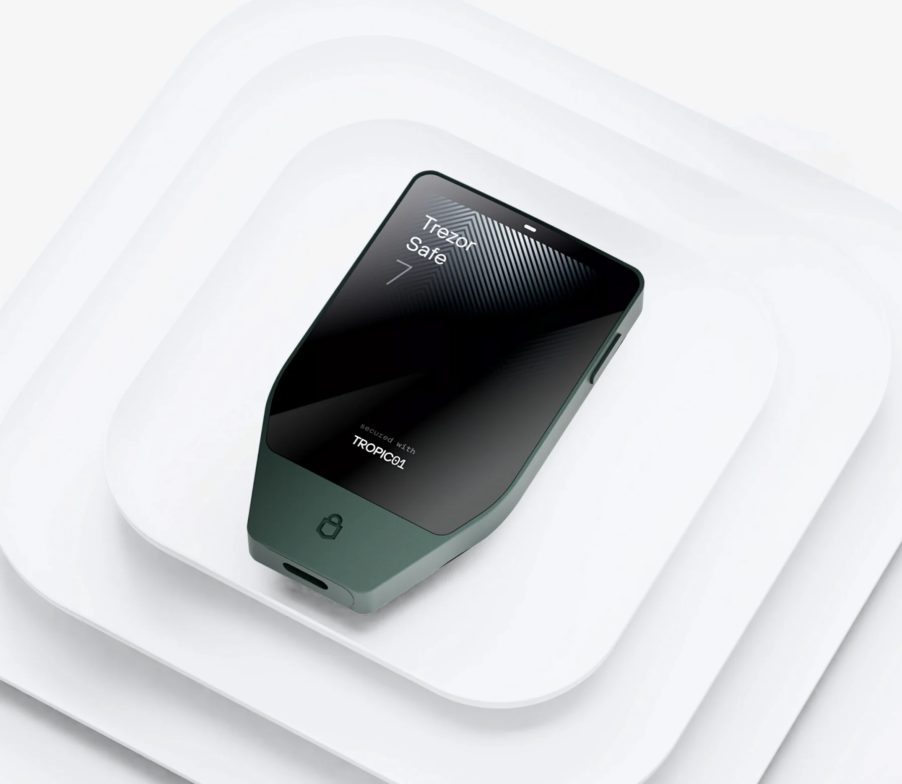
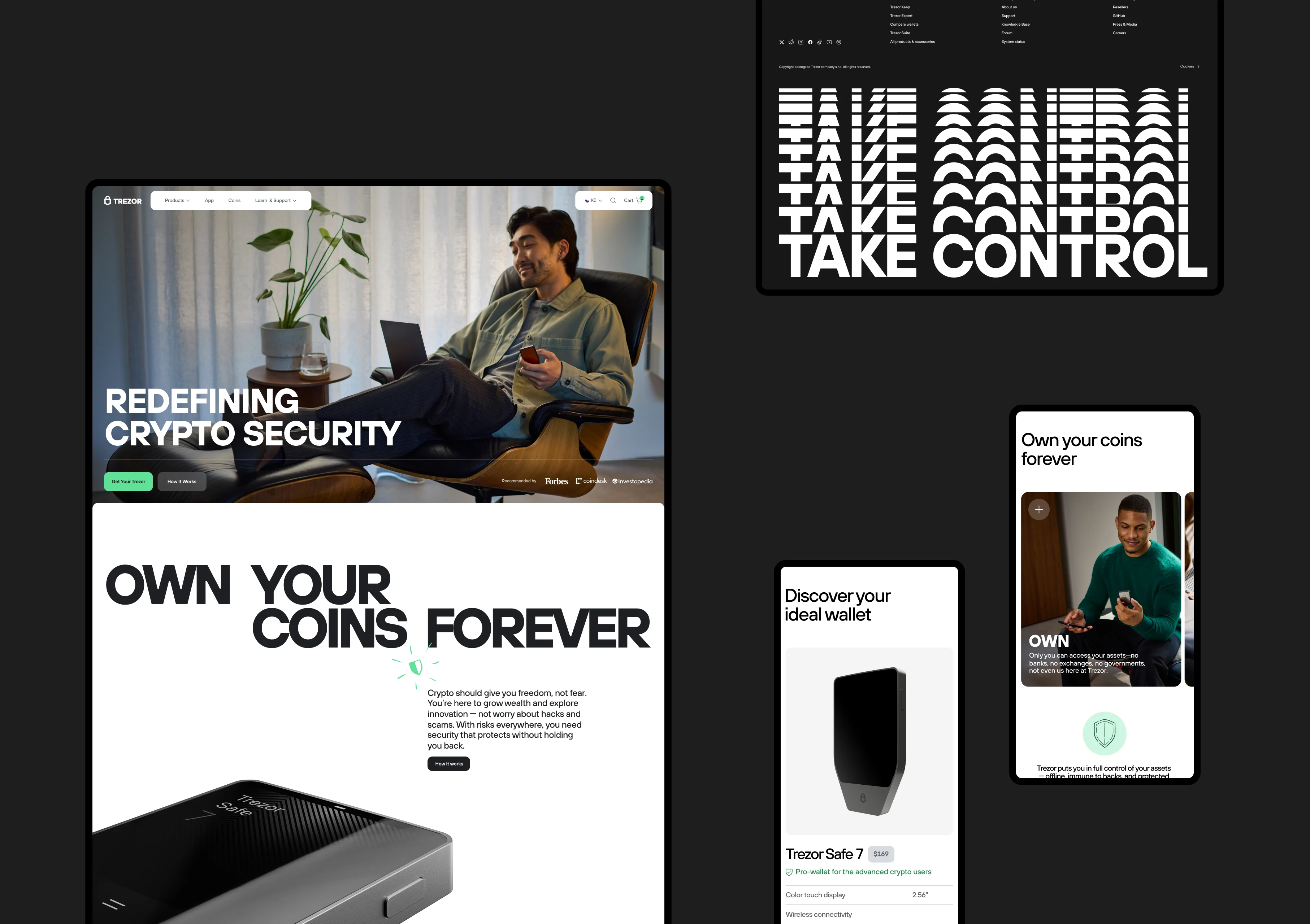
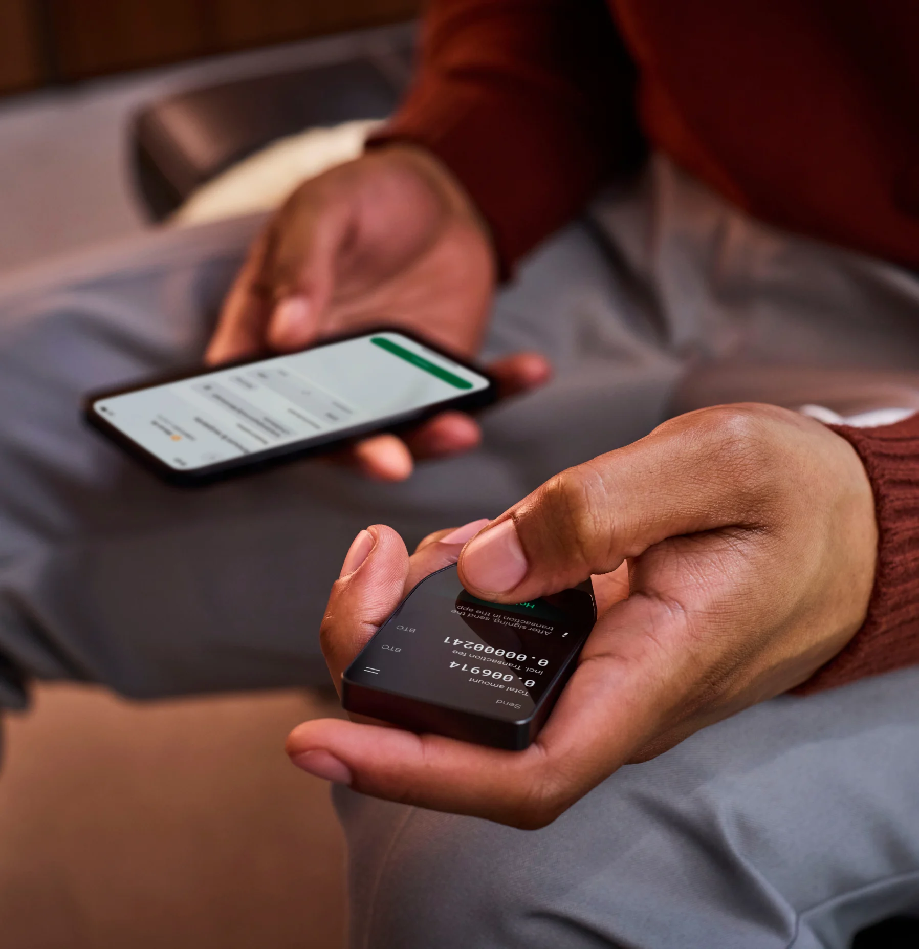
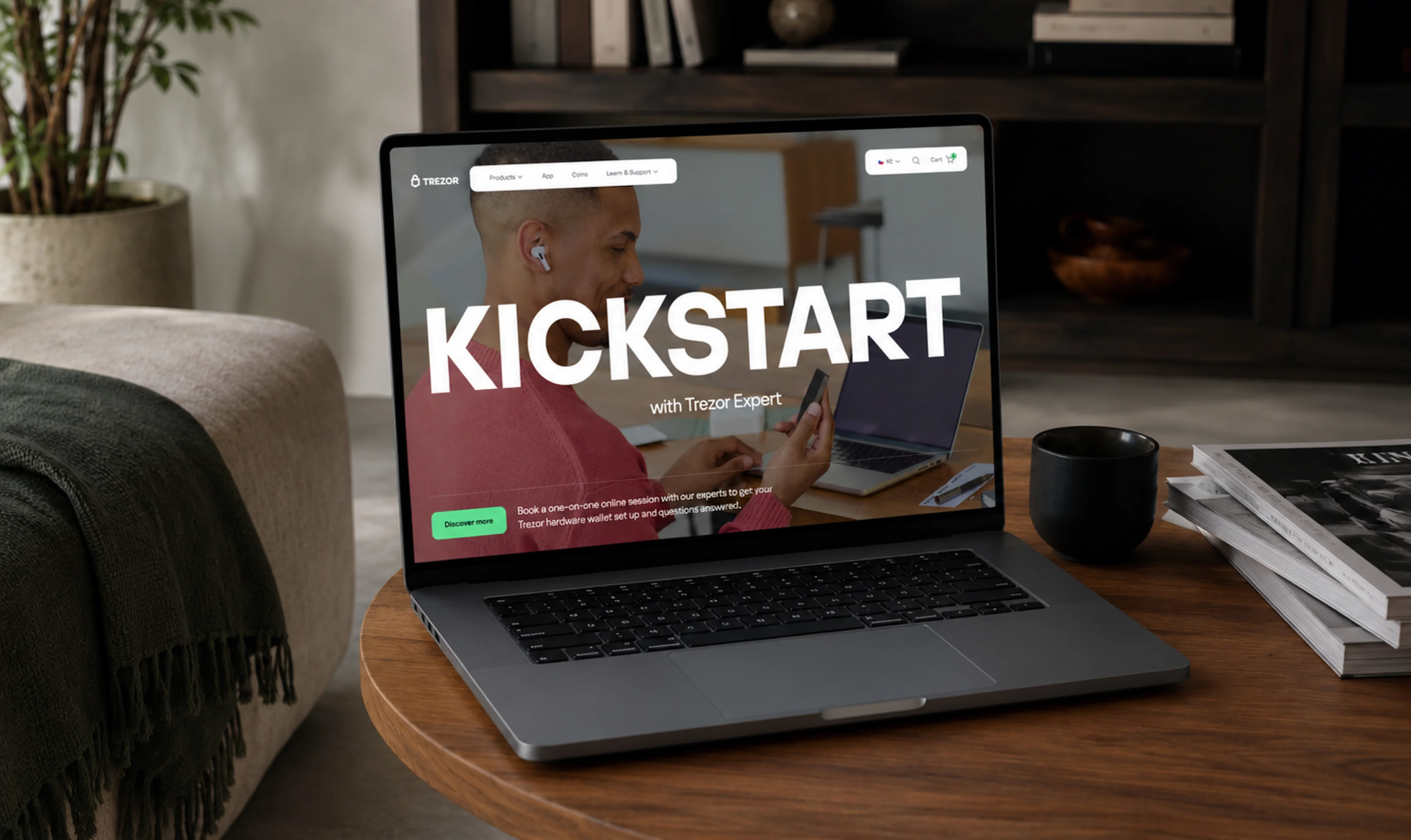
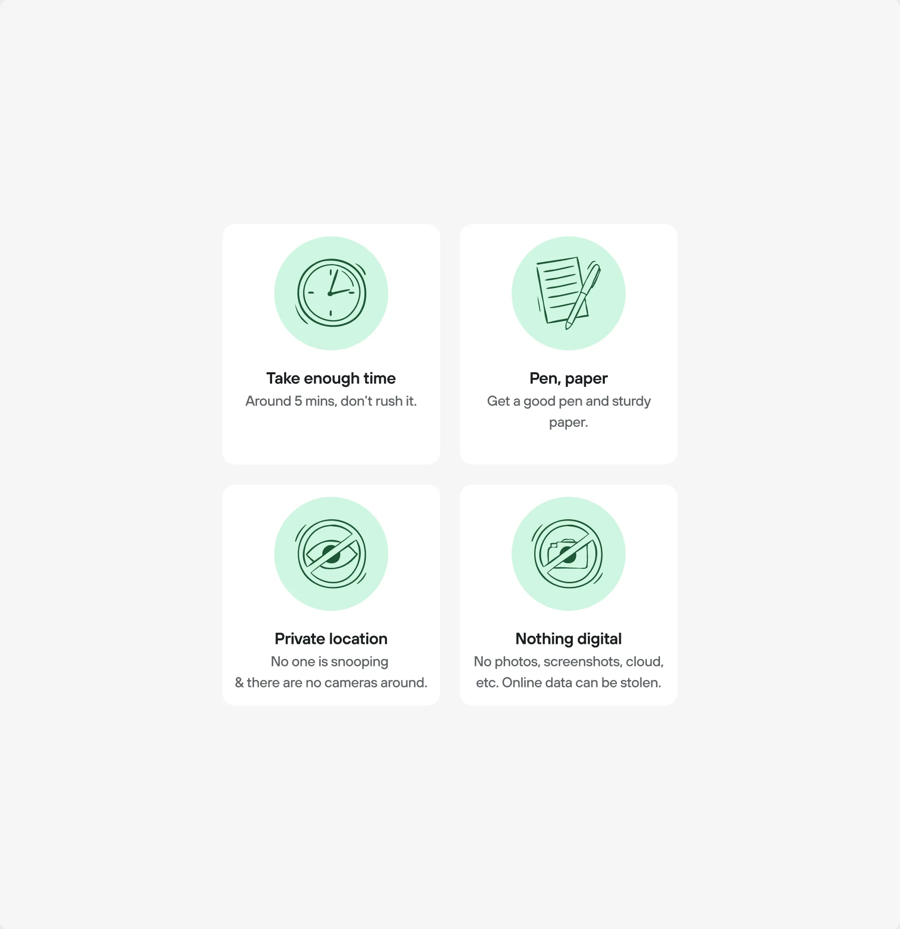

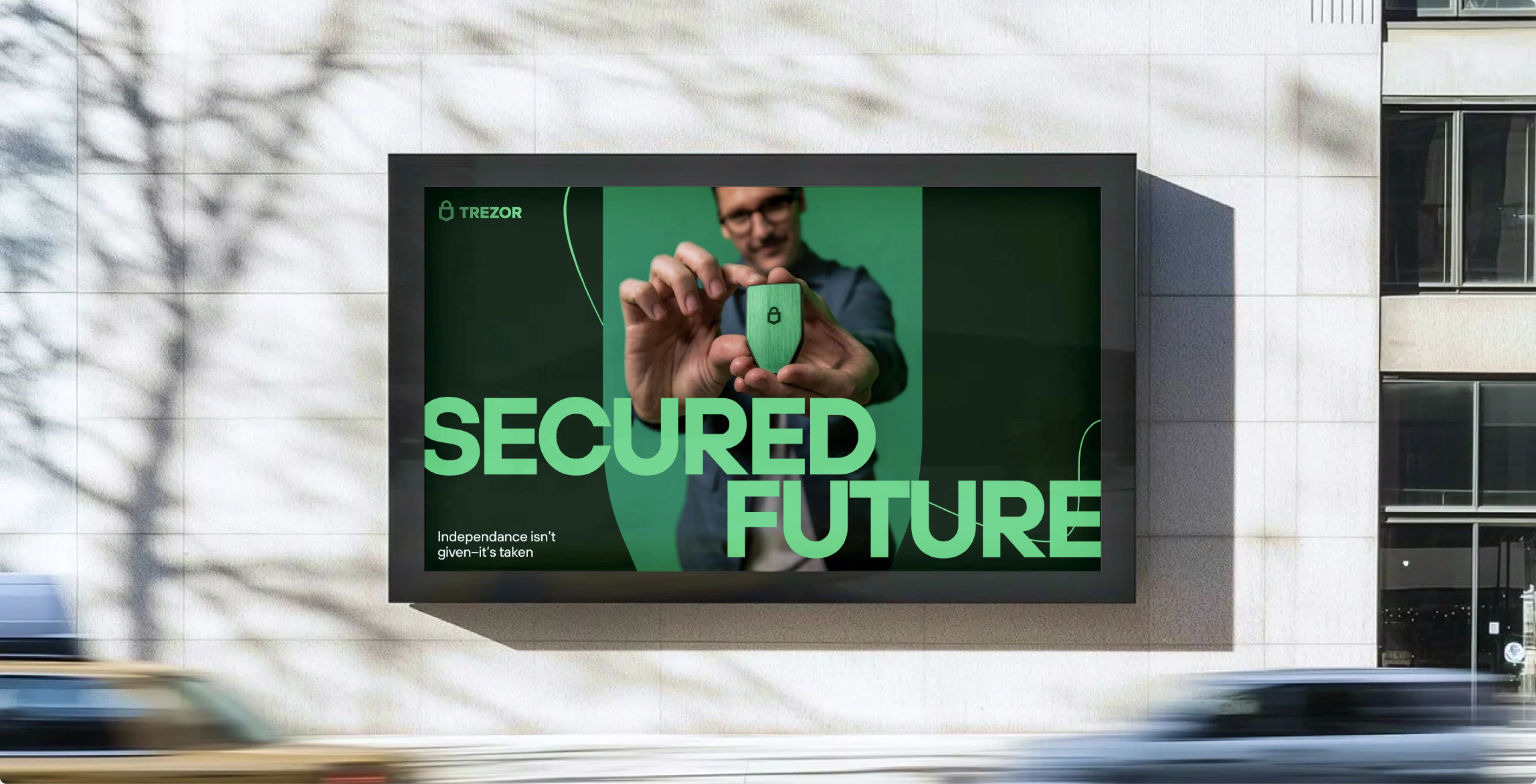
Trezor entered the facelift as a brand for crypto natives – people who already understood why self-custody matters. It came out with something harder to build: a voice warm enough for the mainstream, while still feeling serious enough to be trusted with billions. A lifestyle brand that never stopped being a security company.
Credits
- Out of Nothing
- Photoshoot
- Outbreak
- Photoshoot
- Yiskra Studio
- CGI Support
- Illustrations